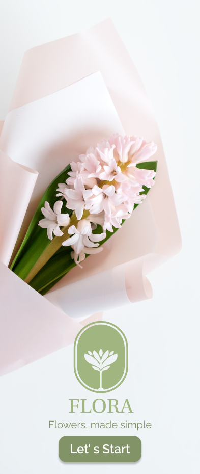
Flora App
A mobile experience designed to simplify how people discover, plan, and purchase floral arrangements with confidence, clarity, and beauty.
Project
Overview
Flora is a mobile app designed to simplify how people discover, plan, and purchase floral arrangements. The experience focuses on reducing uncertainty by helping users explore local florists, preview available flowers, and create arrangements with confidence all without needing to visit multiple shops in person.
What’s making
this hard?
Planning floral arrangements especially for events like weddings is often time-consuming and overwhelming. Users lack visibility into nearby florists, available flowers, and whether shops carry what they need.
- Difficulty finding nearby florists
- Uncertainty around seasonal flower availability
- Visiting multiple stores in person
- Decision fatigue when selecting arrangements
- Limited time for in-person shop visits
Design a mobile
solution that…
Helps users discover local florists based on their location
Lets users browse available flowers and arrangements before committing
Enables bouquet customization with ease and confidence
Provides efficient, time-saving solutions for busy users
User Personas
Research revealed two primary user types with distinct goals but a shared frustration: the existing floral shopping experience was not built for how people actually live and plan.

Kayla Mend
A newly engaged user planning her wedding who needs clarity on which florists carry the flowers she wants without visiting multiple locations. She is excited but overwhelmed by the sheer number of decisions ahead of her.
- Find wedding florists near her venue
- Preview floral arrangements before visiting
- Compare styles and availability in one place
- Reduce the number of in-person visits
- Uncertainty about seasonal availability
- Decision fatigue from too many options
- No clear way to compare florists online
- Limited time between work and planning

Gina Baptis
A working mother who frequently sends floral gifts and needs a fast, reliable way to order arrangements without disrupting her schedule. She values efficiency over exploration and wants a trustworthy, quick experience.
- Order flowers quickly without long browsing
- Find reliable local florists with reviews
- Schedule delivery or pickup easily
- Reorder previous arrangements
- No time for in-person visits
- Unclear delivery options and timing
- Cannot see products before purchasing
- Lack of guidance for gift occasions
Mapping the Experience
Mapping the user journey revealed key moments of friction and where Flora’s design could make the biggest difference.
User looks for nearby florists but gets overwhelmed by scattered results and unclear availability.
UncertainToo many options with no clear way to compare styles, pricing, or availability in one place.
OverwhelmedUser visits multiple stores in person to see flowers before committing — expensive in time.
FrustratedUser finally commits after exhaustive research. Relief but the process took far too long.
RelievedTo reduce friction, I designed a guided 7-step flow:
for brides
my local florist
few
favorites
A modern digital
floral boutique
Flora’s brand was designed to feel soft, elegant, approachable, and modern like walking into a beautifully curated flower shop. Every visual decision supports calm, confidence, and clarity.
The Final
Experience
The final design creates a calm, guided, and visually rich experience. Click any screen to view it in full.
What makes
Flora work
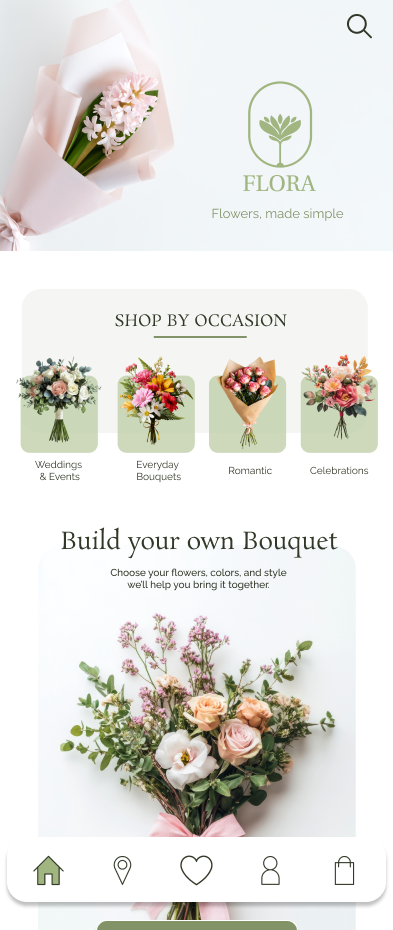
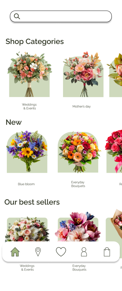
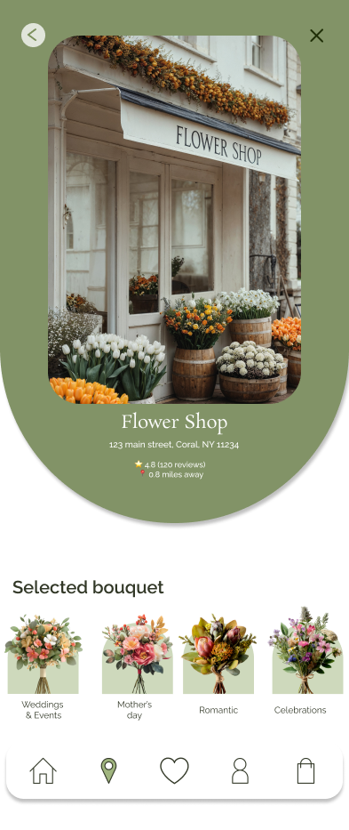
Guided Discovery
Users browse by occasion — weddings, gifts, celebrations — to reduce decision fatigue and surface relevant options immediately.
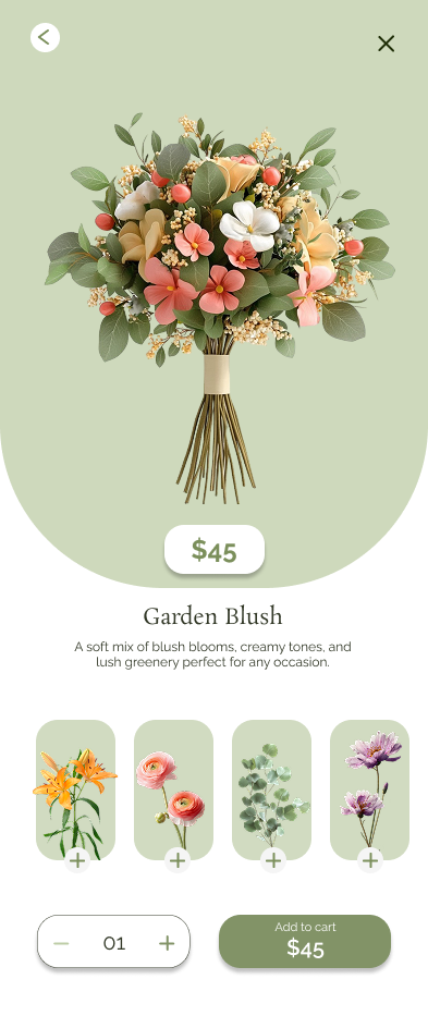
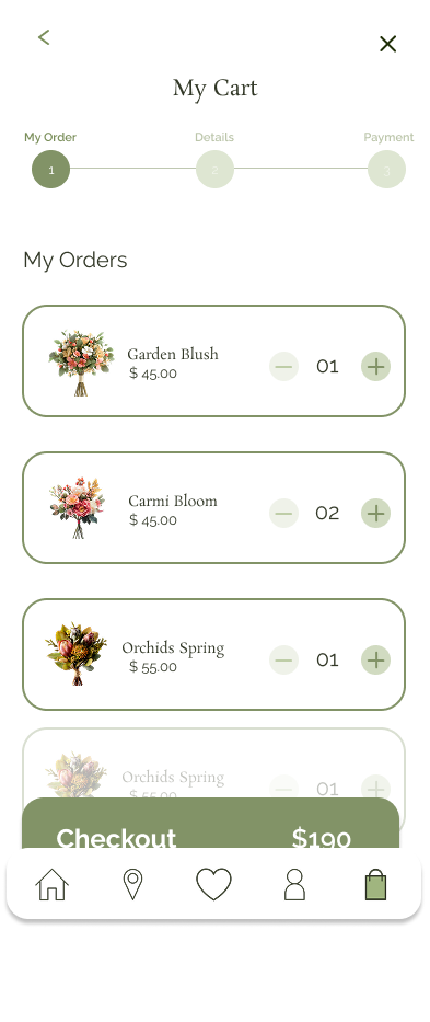
Custom Bouquet Builder
Users can create personalized arrangements based on their flower preferences, color palette, and occasion — with full creative control.
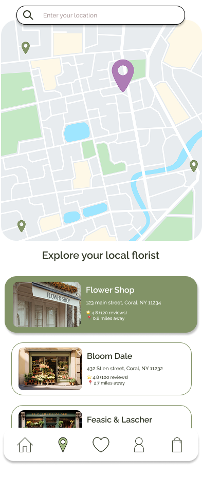
Local Florist Finder
A map-based experience helps users discover nearby florists instantly, with preview cards showing availability and style.
Product Clarity
Each arrangement includes a name, description, and key floral elements — giving users the information they need to decide with confidence.
Testing &
Iteration
Usability
Findings
- Users needed clearer guidance during selection
- Navigation between browsing and purchasing needed refinement
- Delivery vs pickup options needed better visibility
Design
Iterations
- Simplified navigation structure
- Improved labeling and content clarity
- Strengthened calls to action throughout
- Enhanced product detail experience
Accessibility
Considerations
- High contrast text for readability
- Clear visual hierarchy across all screens
- Text and icon pairing for comprehension
- Mobile-friendly tap targets throughout
What I
Learned
This project strengthened my ability to translate user needs into thoughtful design solutions — balancing aesthetics with usability while designing a complete mobile experience from concept to prototype.
The most valuable lesson was how much clarity in the early research phase shapes every downstream design decision. The user journey mapping revealed pain points that completely changed how I structured the navigation — moving away from category browsing toward occasion-based guided discovery.
Iterating based on usability testing showed how small changes in labeling and call-to-action placement can dramatically improve user confidence and task completion.
Next Steps
If this project continued, the next phase would focus on: