JustFab
Mobile App
A mobile-first UI design concept for JustFab, a subscription-based fashion platform, centered on refining visual clarity, hierarchy, and interaction patterns. The project focused on elevating the overall interface through thoughtful layout systems, typography, and component design to create a more seamless and engaging browsing experience.
Light user input informed key decisions around navigation and core actions, but the primary focus remained on crafting a polished, design-forward interface that enhances usability through strong visual communication.
The
Problem
“Users had to work harder to interpret the interface and navigate core features.”
The JustFab mobile interface lacked the visual clarity and hierarchy needed to support a smooth user experience. Key actions like browsing personalized picks, reviewing subscription details, and skipping a month were available, but not presented in a way that felt immediately clear or naturally guided.
Without strong design cues and a more structured layout, users had to work harder to interpret the interface and navigate core features. This weakened the overall experience and highlighted opportunities to improve the app through more intentional UI design.
Light
Research
As part of the project, I asked a small group of working women ages 18–35 about their familiarity with JustFab and their thoughts on whether the brand needed a mobile app. Their responses pointed to a shared expectation that a fashion subscription brand like JustFab should have an app experience that feels more natural for mobile use.
Participants described mobile browsing as more convenient than desktop and viewed an app as a more modern and accessible way to engage with the brand. This light research was used to support the direction of the project, while the main focus remained on UI design and visual execution.
I’ve been using JustFab for five years, and it is about time that they get an app. It’ll be easier to use.
User 1 — JustFab User, 5 yrsI think it is essential for a retail store to have an app, especially since everyone’s doing it. I would start using it.
User 2 — Non-JustFab UserI found myself using my phone more than a desktop. Having an app would be more natural to use.
User 3 — JustFab User, 7 yrsWhat the research revealed
Mobile-first behavior is expected
Users naturally prefer browsing and shopping on their phones over desktop. Mobile is the default, not the exception.
A dedicated app feels essential
Even non-users associate modern retail brands like JustFab with having a dedicated mobile app experience.
Convenience drives engagement
Users believe an app would make browsing and interacting with the platform easier and more natural day-to-day.
Stronger UI guidance needed
A well-structured interface can better support everyday actions like skipping a month and improve overall flow.
Key Features
at a Glance
These visuals explain why users would want the JustFab app — and highlight the core features a dedicated app would bring over the existing website experience.
Feature Overview
Mobile Experience
Old
Design
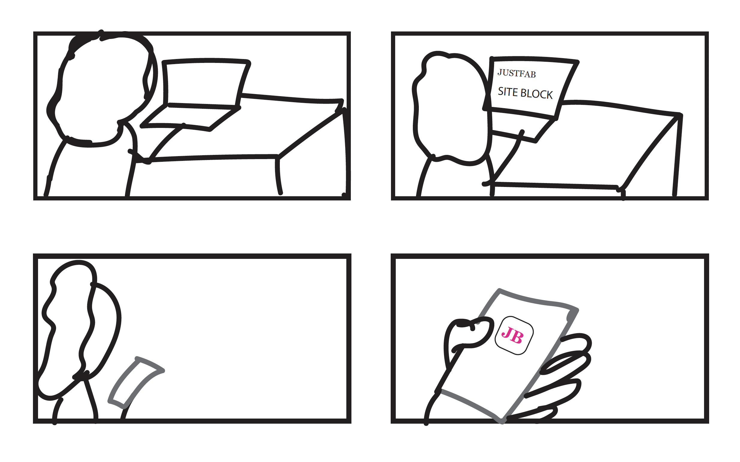
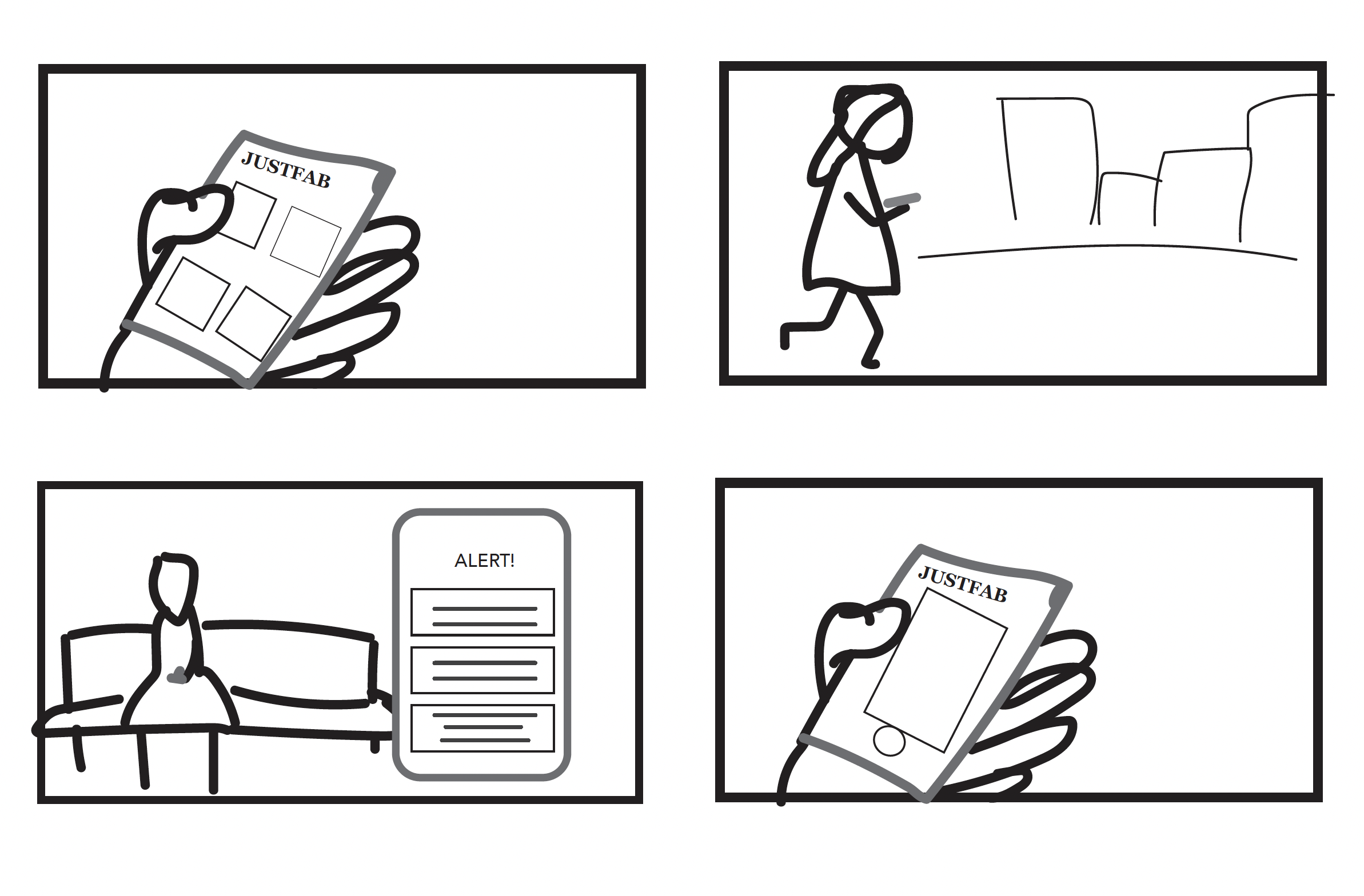
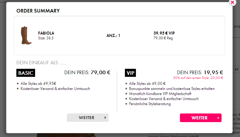
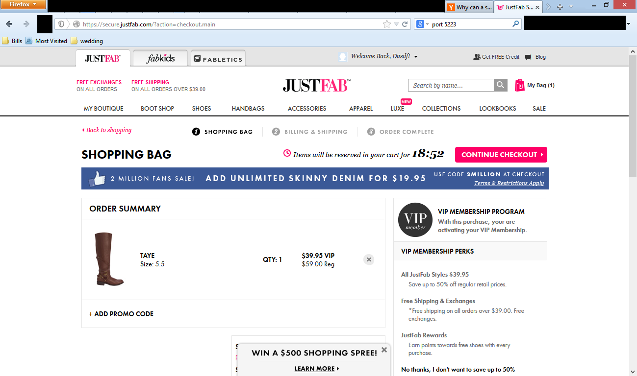
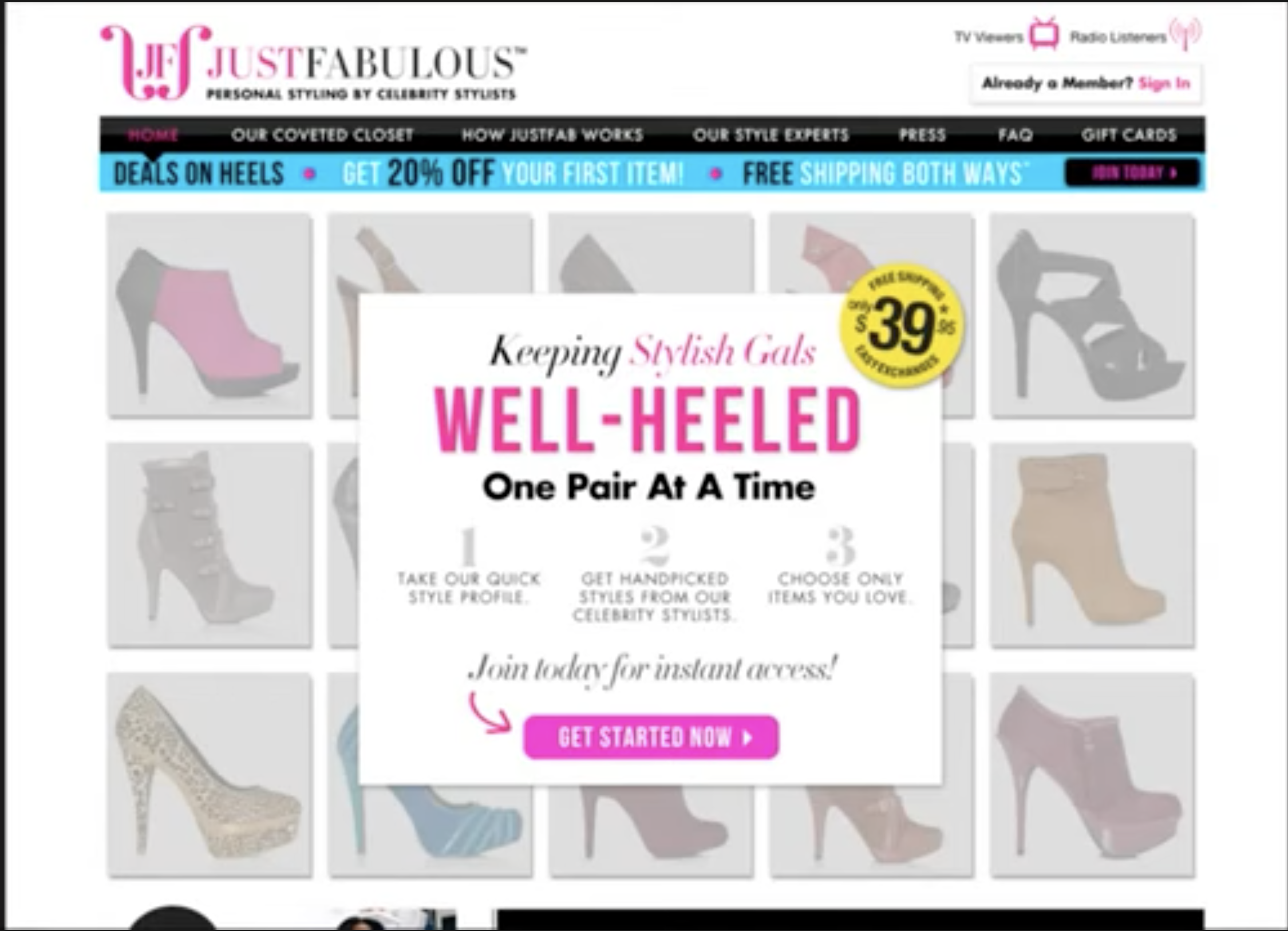
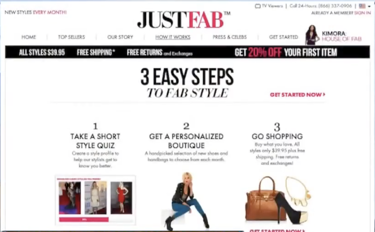
At the time, JustFab did not have a dedicated mobile app, requiring users to rely on a web experience that did not fully support mobile-first behavior. This created frustration for users who wanted a faster, more natural way to browse and manage their membership.
A major issue was the lack of visibility around key actions, especially the option to skip the month. Combined with a visually crowded layout and weak hierarchy, the experience made common actions feel more difficult than necessary.
- — No dedicated mobile app
- — Skip the month feature hidden
- — Crowded, low-contrast layout
- — Weak visual hierarchy
Crafting a
Cohesive UI
A structured layout system was developed to bring consistency across screens, improving alignment, spacing, and content organization.
Refined using typography, scale, and contrast to highlight key actions and guide user attention naturally through the interface.
Consistent patterns for buttons, cards, and navigation elements designed to feel intuitive and reinforce usability through clear visual cues.
Applied strategically to enhance readability, strengthen brand presence, and create a modern, elevated interface.
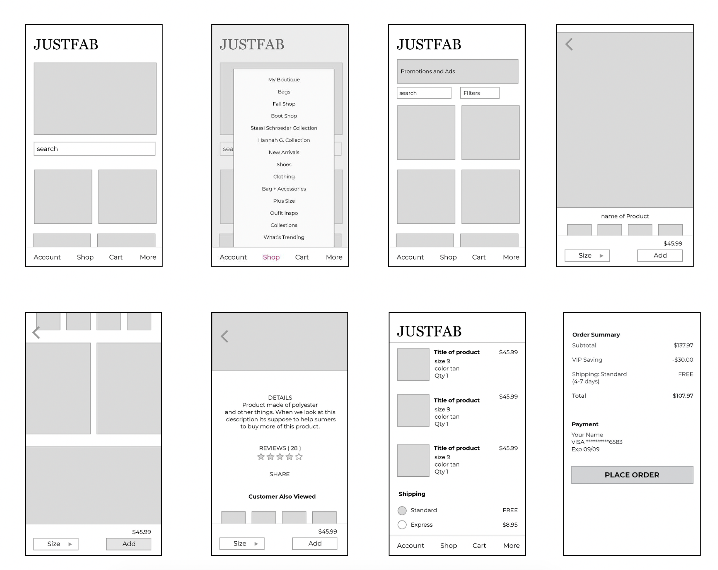
Rough Draft
& User Response
Early design explorations focused on improving layout structure, visual hierarchy, and navigation patterns. After creating the first draft, it was mocked up on InVision and tested with both JustFab users and non-users.
First Draft — InVision Prototype
- Skip the month should be more visible
- Zoom-in details on clothing
- Visible access to monthly picks
- Nav bar on the bottom
- Less words on the menu
- A section to post pictures in reviews
- Easy to navigate — yes
- Enjoys scrolling and exploring
- Comfortable with bottom nav
- First impression: the hero image
- Able to click on the size
- Zoom-in details on product
- Price clearly visible
- Similar items / also purchased
- Season picks visible on home page
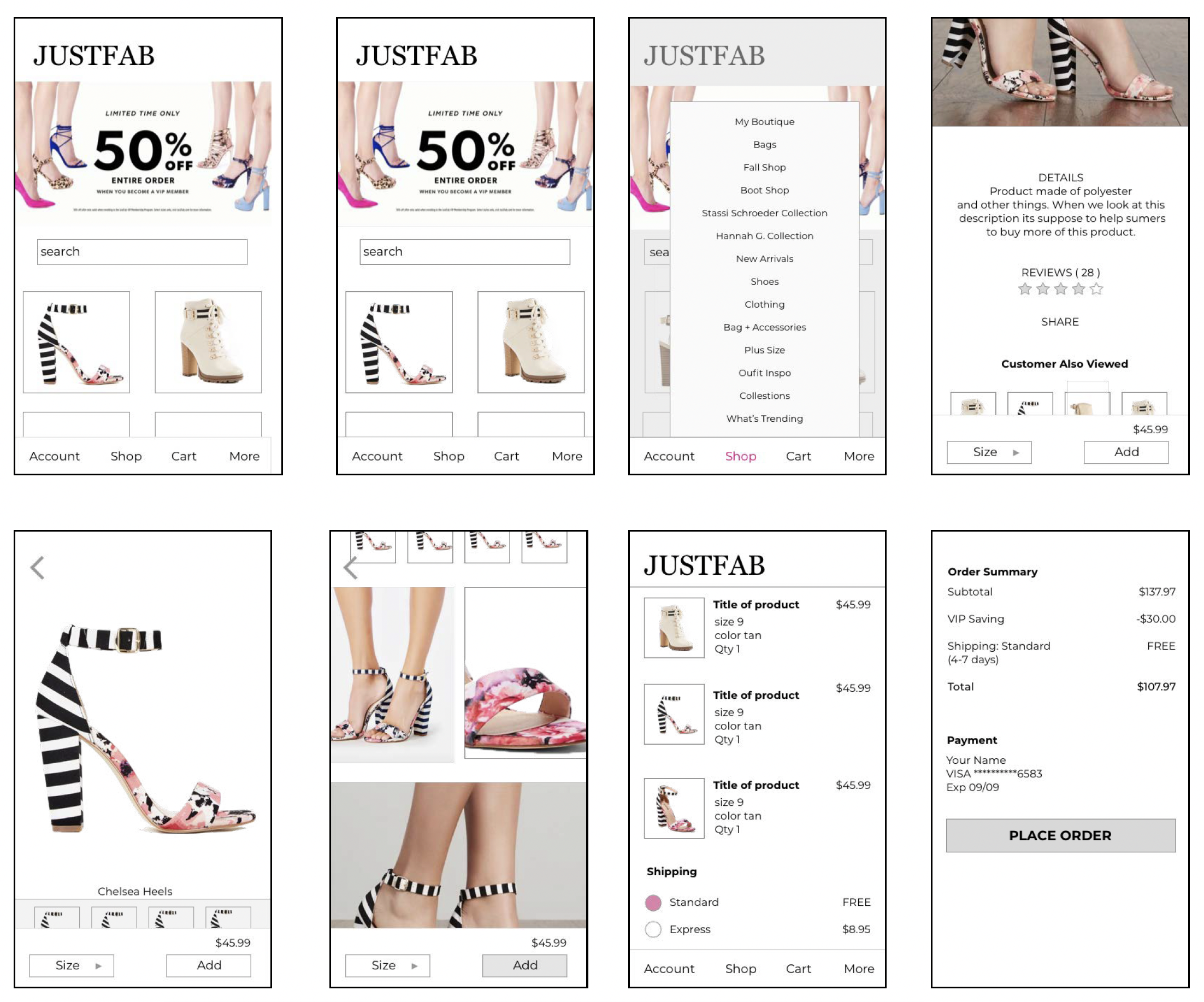
The Final
Experience
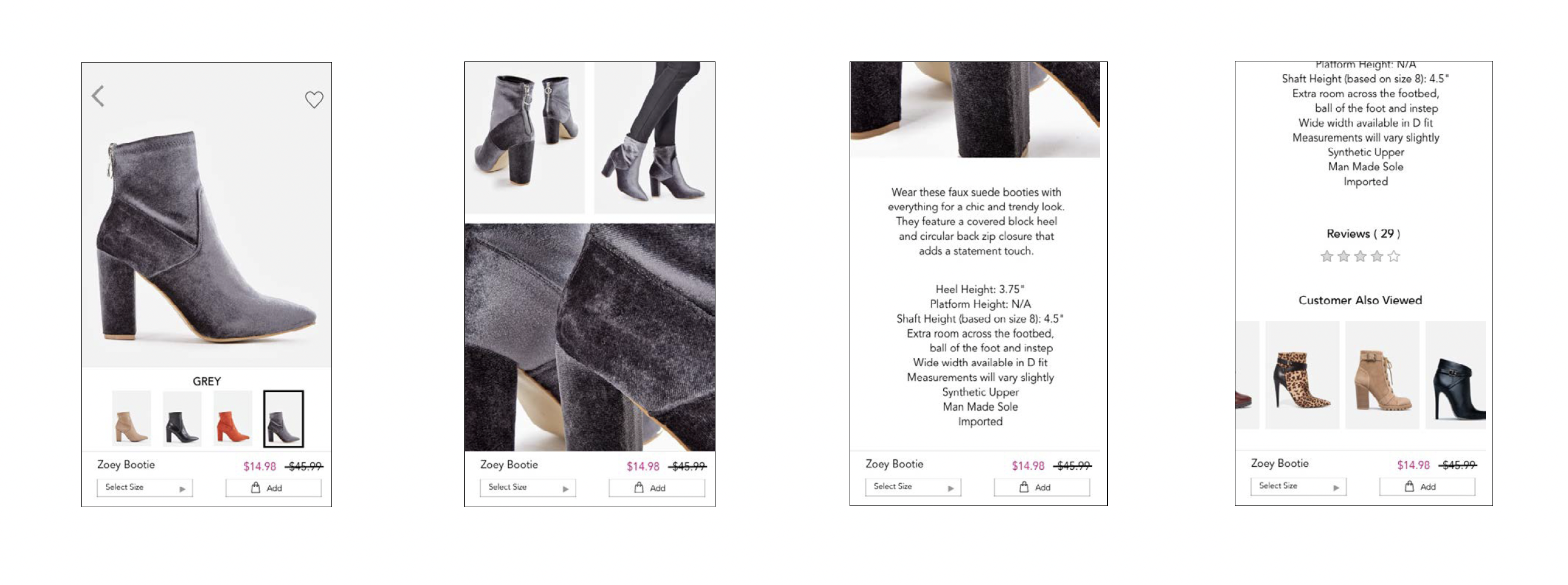
A mobile-first interface that prioritizes clarity, structure, and ease of interaction — designed to help users navigate key actions naturally and with less effort.
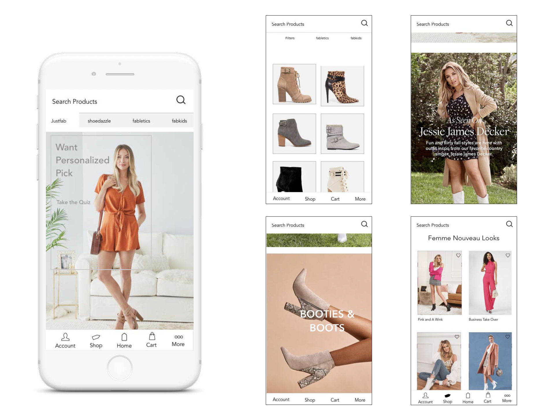
Interaction Flow
Shopping Experience
What This
Project Proves
Through a UI-focused approach, this project transformed a dense, web-based experience into a streamlined mobile interface. By introducing clear hierarchy, structured layouts, and consistent design patterns, the final design supports more intuitive interaction and improves overall usability.
This project demonstrates how strong UI design can elevate a product experience, making complex interactions feel simple, accessible, and visually cohesive.
Structure over decoration — A well-organized interface reduces cognitive load and helps users complete tasks with confidence.
Mobile-first thinking — Designing for the phone first leads to cleaner, more intentional decisions across the board.
Hierarchy is the product — When users can immediately see what matters, they engage more naturally and trust the experience.
JustFab Mobile App — UI Design Concept
UI Design ✦ Case Study