Cottages at
Forest Park
Project Overview
Cottages at Forest Park is a website for a 55+ residential community in Lafayette, Colorado. While the site contained useful information, the experience felt outdated and difficult to navigate. Users had trouble understanding the purpose of the website, finding housing details, and locating important community information.
This project focused on evaluating the existing experience and creating prototype drafts for a clearer, more user-friendly layout. My work combined user research, heuristic evaluation, accessibility review, usability testing, and low- to medium-fidelity prototyping to identify major usability issues and propose solutions.
What needed
to change
The website no longer reflected the needs of the community it serves. What once functioned as a promotional site for a new housing development now felt unclear for today’s users — including prospective residents, current residents, family decision-makers, and real estate professionals.
The main design challenge became: How might I redesign the site so users can quickly understand the community, compare housing options, and find important information without confusion?
The Process
To better understand the problem, I used several UX methods across the project:

User Research
I gathered survey data from participants representing likely users, including:
- adults exploring 55+ communities
- current or future retirees
- family members helping parents research housing
- users with different comfort levels using websites
The survey focused on user goals, expectations, device usage, pain points, and trust.
Heuristic Evaluation
I evaluated the site using Jakob Nielsen’s 10 usability heuristics, rating issues by severity. Problems identified included:
- navigation clarity
- content overload
- consistency
- recognition vs. recall
- aesthetic and minimalist design

Accessibility Review
I completed an accessibility audit to identify issues related to readability, contrast, structure, and overall access for older adults and users with visual challenges.
Usability Testing
Using team-created testing materials, I conducted moderated usability tests and observed how participants completed realistic tasks on the current website.
What the research
revealed
Across surveys, evaluations, and testing, the same patterns appeared again and again.
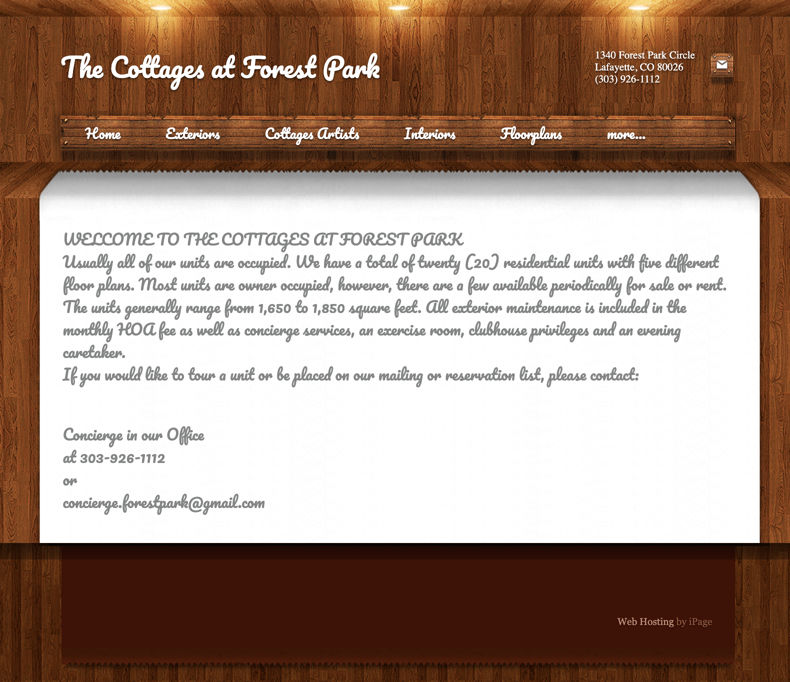
Many participants were unsure whether the website was meant for:
- prospective residents
- current residents
- people trying to buy or rent
- or all of the above
This uncertainty created confusion from the very beginning of the experience.
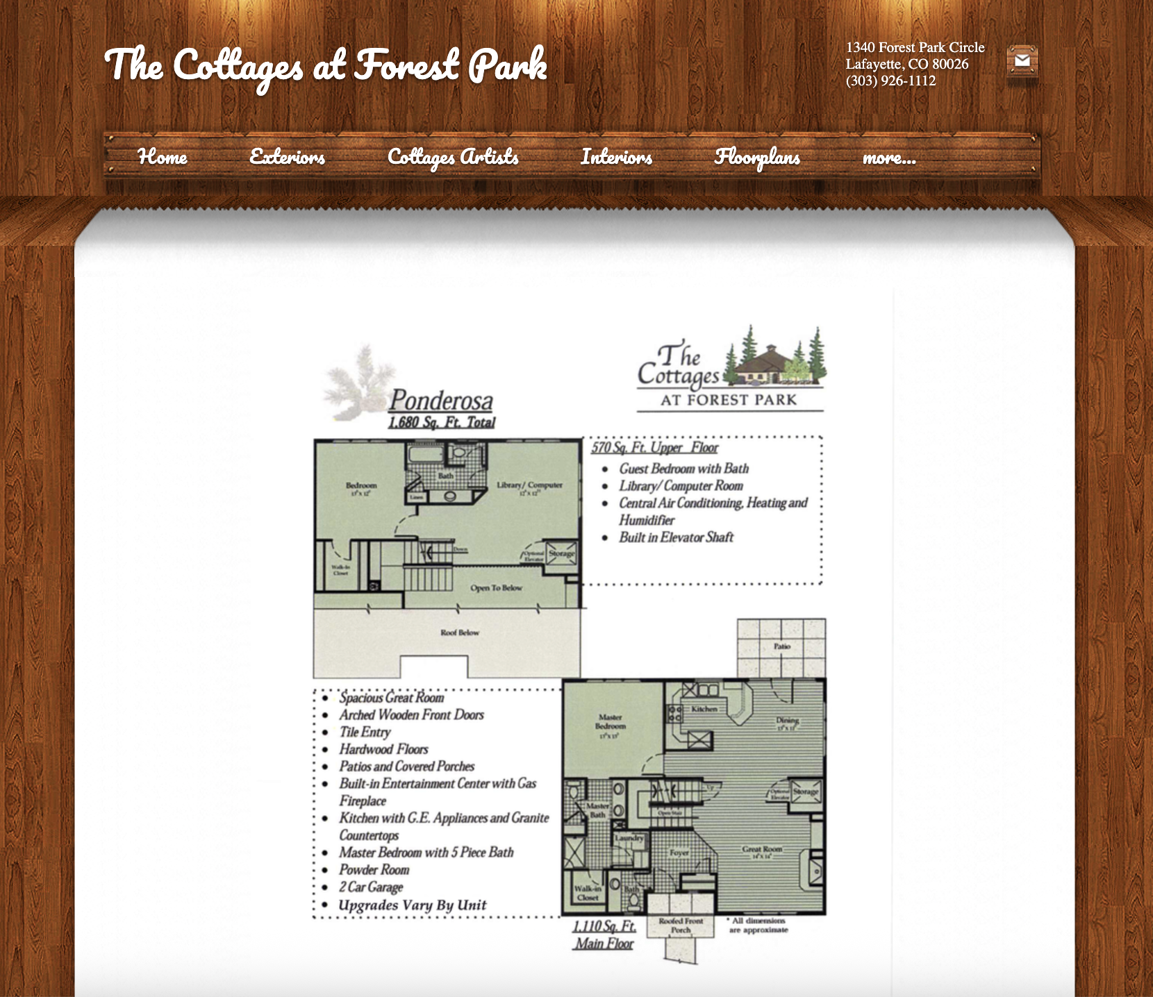
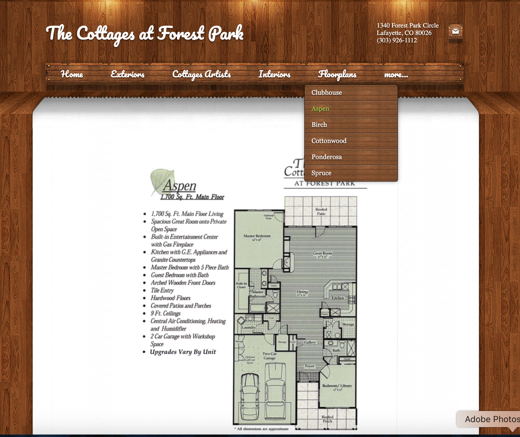
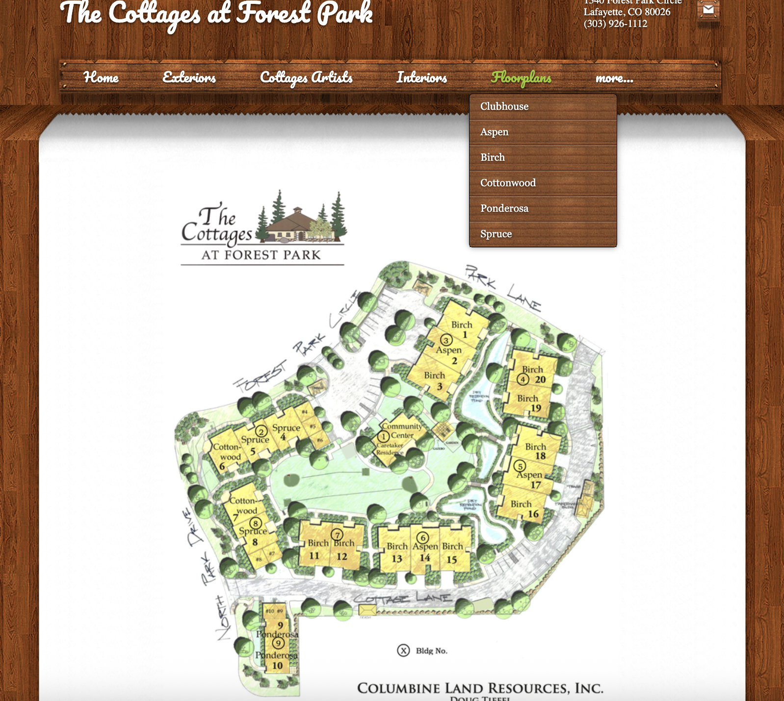
Users expected a clear list of homes with floor plans, pricing, availability, and photos connected to each home. Instead, this information felt incomplete, buried, or disconnected across pages and documents.
A repeated theme was that users wanted photos, floor plans, pricing, home details, availability, and contact options grouped together on one page — not scattered across the site.
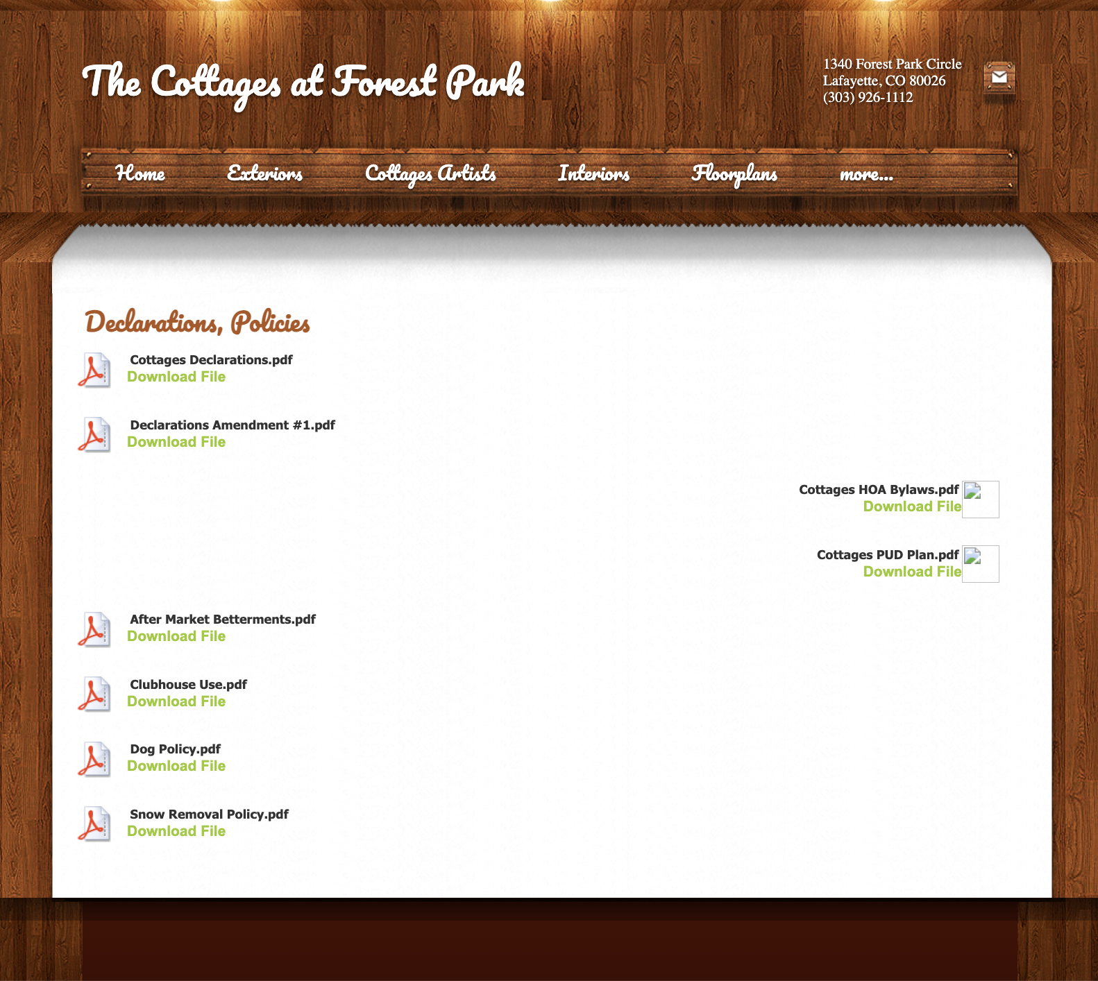
Participants often backtracked, clicked multiple pages to find one answer, misunderstood menu labels, and struggled with “More…” or unclear subpages.
Users mentioned difficulty reading the font, wanting larger or bolder text, low confidence with downloadable files, and frustration with too much text in PDFs. This was especially important because the target audience includes older adults.
Who we’re
designing for
Based on the research, different personas were developed to represent the primary user groups interacting with the site.
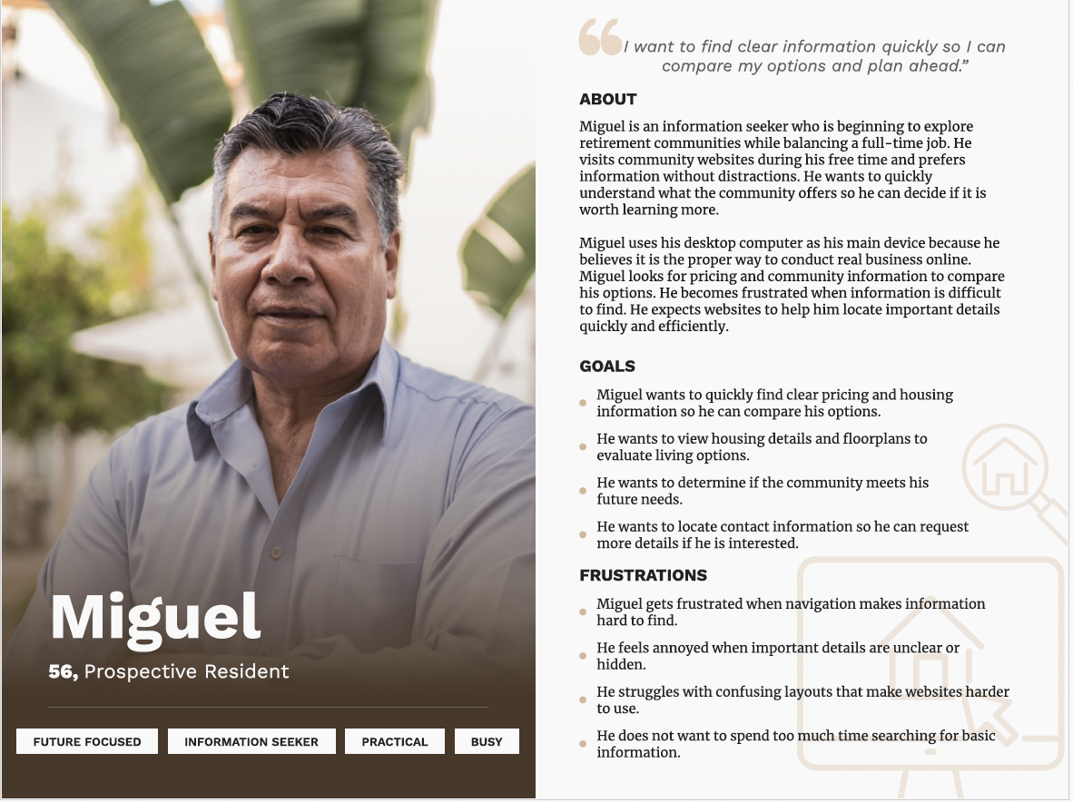
Prospective Resident
A user comparing retirement community options, looking for:
- clear pricing
- home details and photos
- location information
- clear next steps
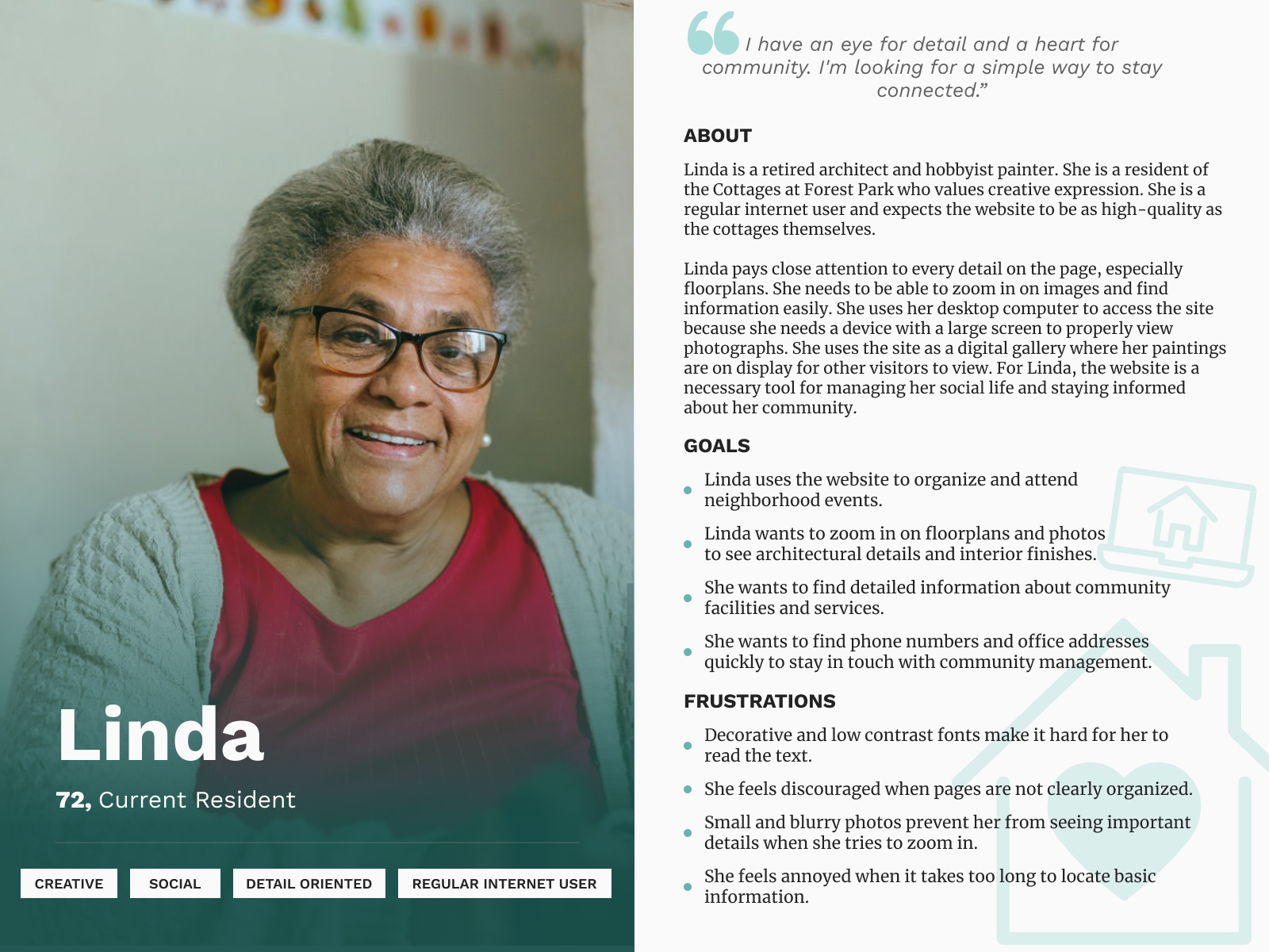
Current Resident
A resident who wants:
- events and activities
- updates and announcements
- community resources
- easier access to resident information
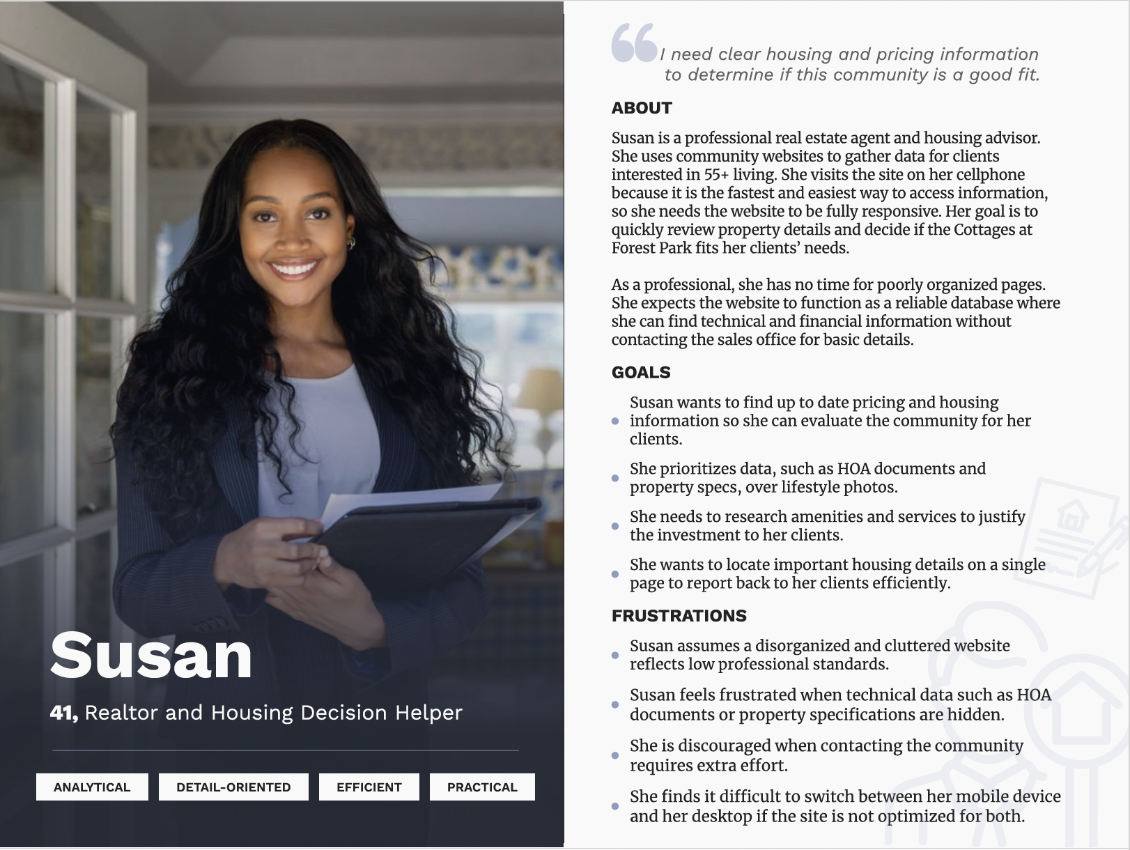
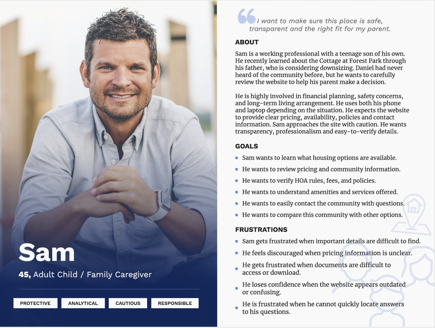
Family Decision-Maker
An adult child helping a parent’s housing decision, looking for:
- trustworthy information
- safety and community details
- clear contact options
- housing comparisons
These personas helped me think beyond one type of visitor and design for multiple user needs.
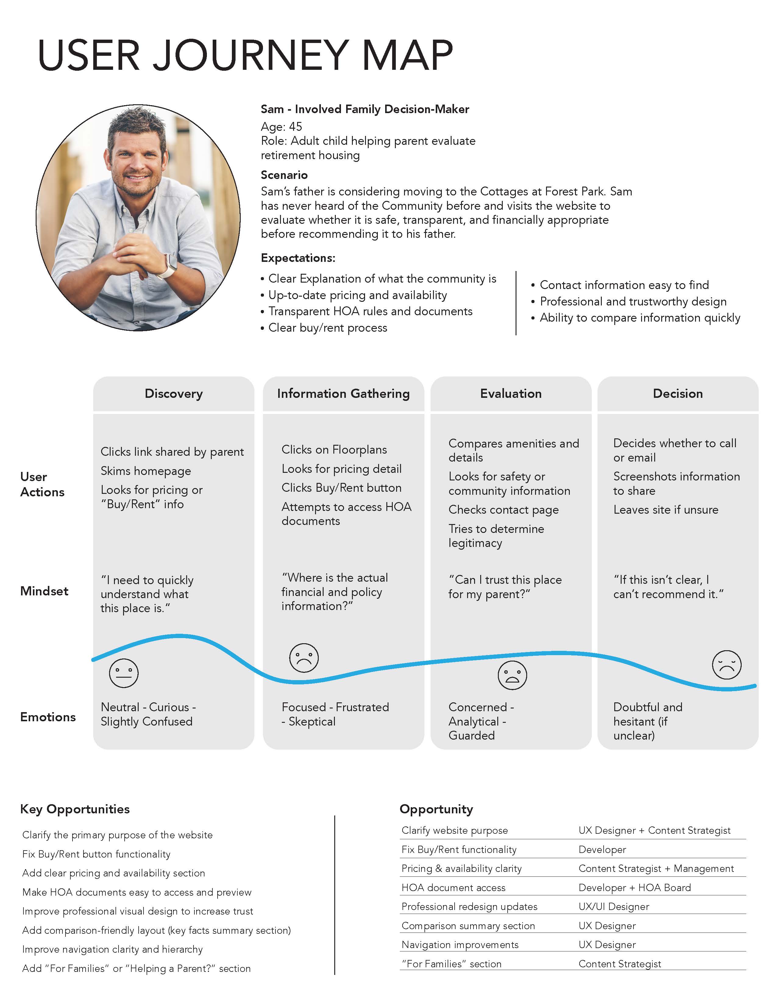
Following Sam’s
experience
To better understand the experience of a family decision-maker, I created a user journey map for Sam, an adult child helping his father evaluate retirement housing. The map revealed how quickly his experience shifted from curiosity to frustration, and highlighted where the website failed to build trust, support comparison, and provide clear housing information.
Clarify purpose
Users needed the website to explain what the community is and who it is for immediately.
Support comparison
Pricing, floor plans, HOA details, and availability needed to be easier to compare in one place.
Build trust
Family decision-makers judged safety, legitimacy, and professionalism before recommending the community.
Design for families
The map showed the need for clearer support for people helping a parent or loved one make a decision.
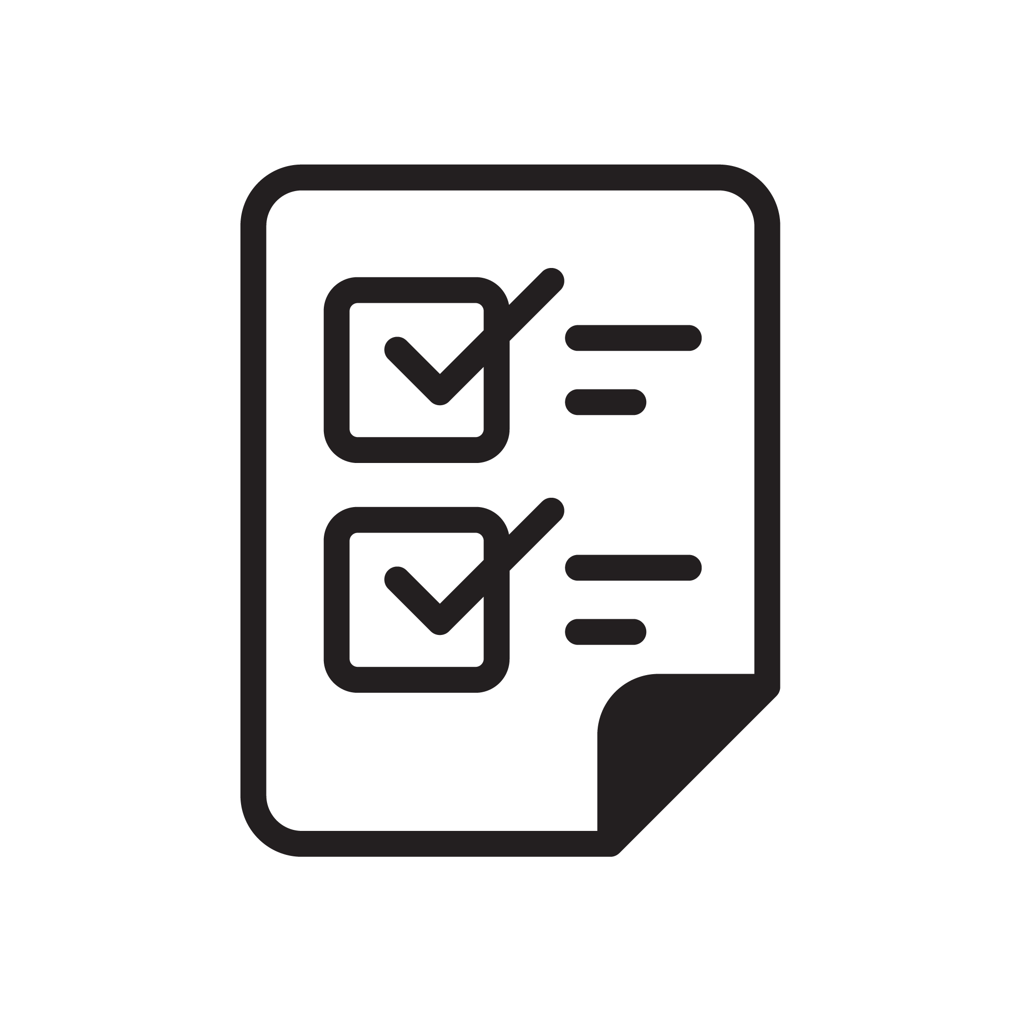
Usability
Testing

30 participants
9 tasks
3 scenarios

2 questionnaires
The usability test scenarios were built around realistic goals users had already expressed. Participants were asked to complete tasks such as:
- finding community information and events
- locating contact information
- finding floor plans and housing details
- locating pricing or buy/rent information
- viewing clubhouse or community-related content
- evaluating the site for a parent or client
The results showed that users could sometimes move through the site, but often did so with hesitation, confusion, or extra effort. Even when information technically existed, it was not always easy to find, understand, or trust.
View full results


Design Goals
Based on the findings, I set the following design goals for the prototype drafts:
Clarify the site’s purpose immediately
Users should understand what the community is and what they can do on the site as soon as they arrive.
Make housing information easier to browse and compare
Home listings, pricing, floor plans, and details should feel connected and easy to scan.
Improve navigation and hierarchy
Users should be able to predict where information lives and move through the site with less friction.
Support both residents and prospective visitors
The site should clearly serve both audiences without forcing them into confusing paths.
Improve readability and reduce reliance on documents
Important information should appear directly on the site whenever possible.
Design Response
To address the major issues found in testing, I created low- to medium-fidelity prototype drafts for key pages.
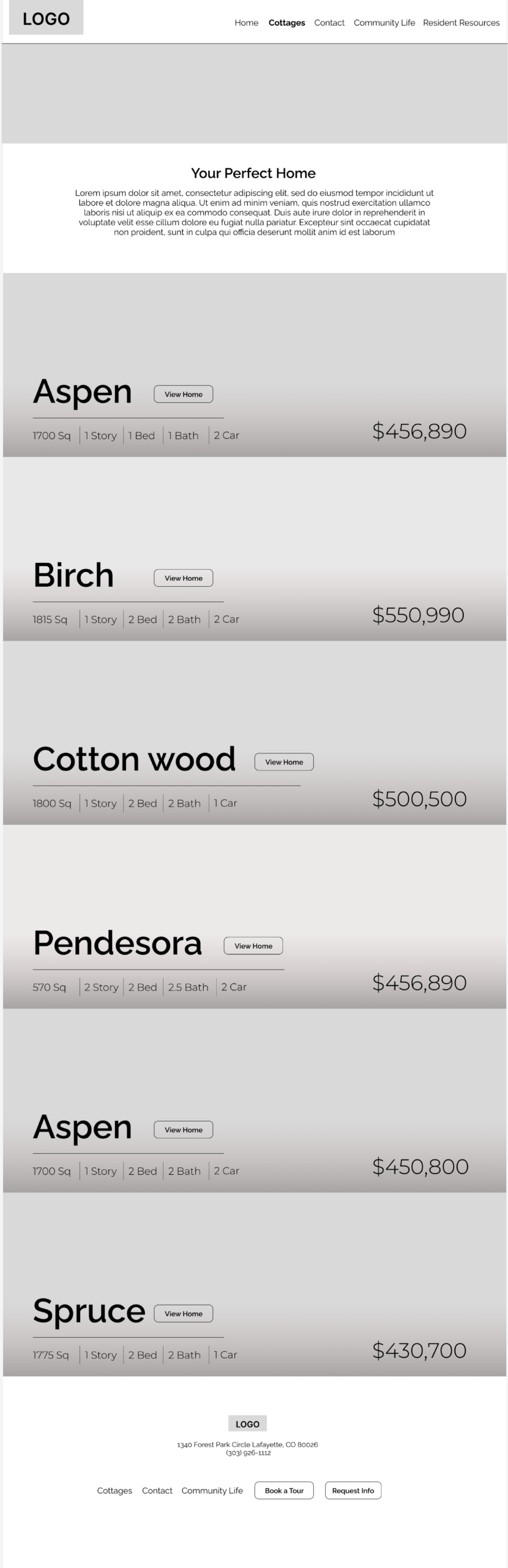
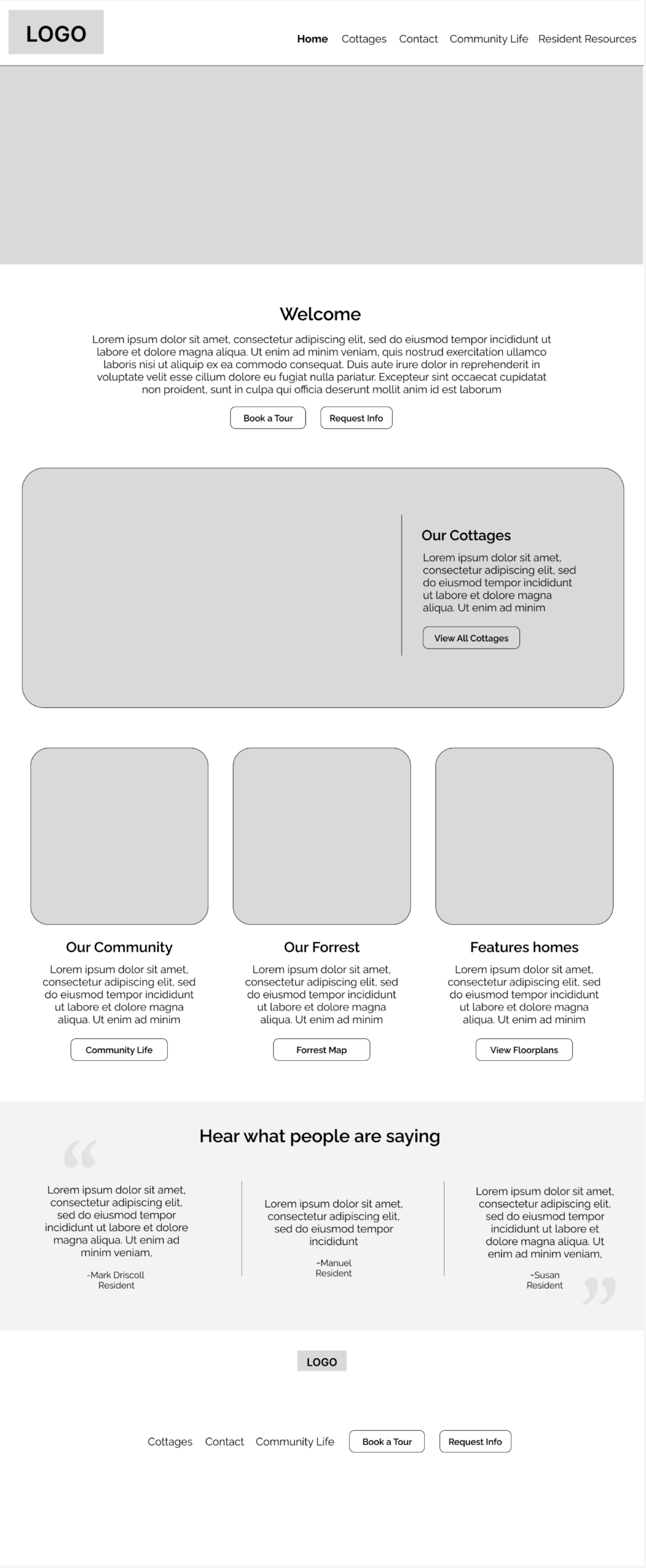
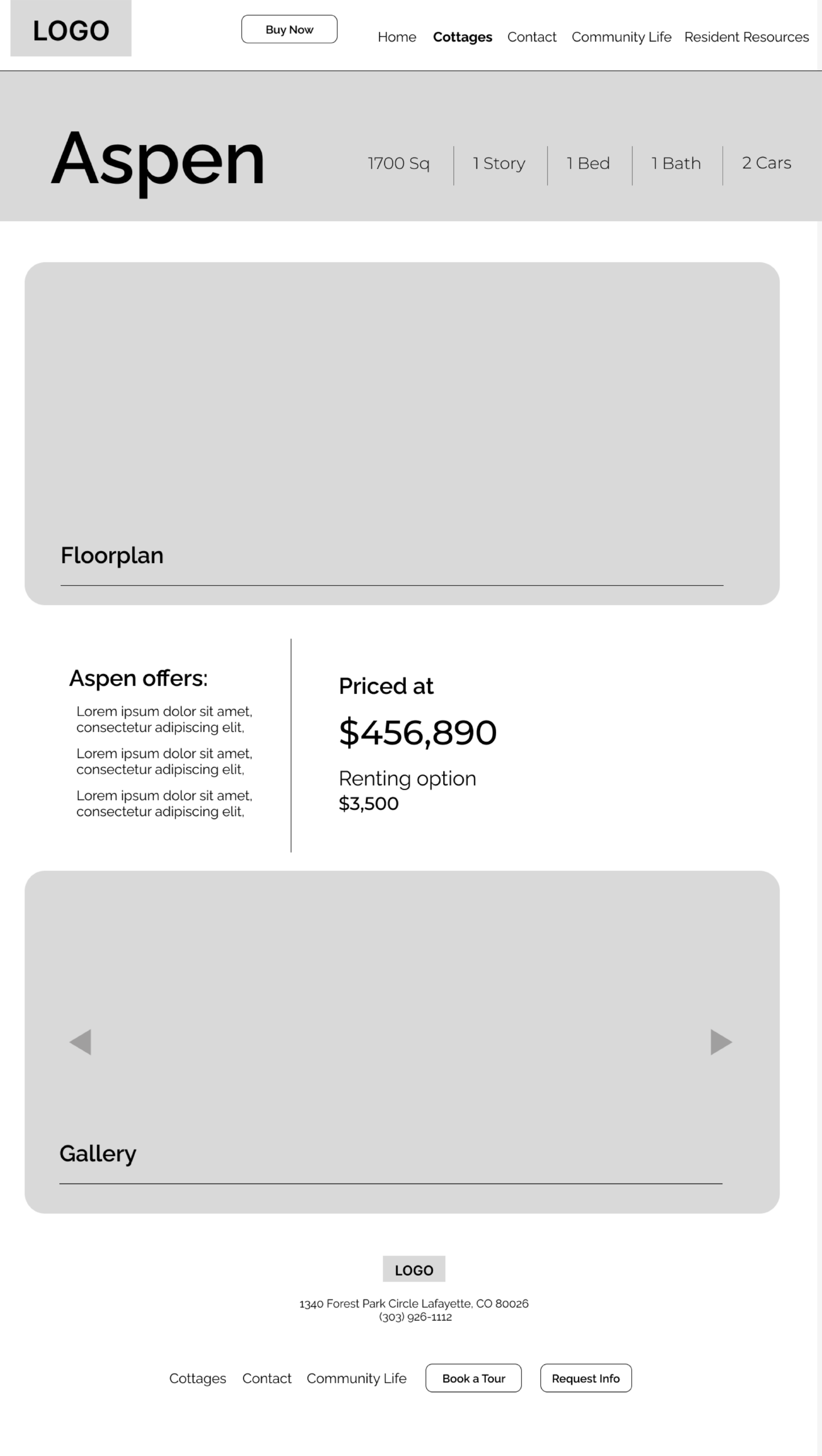
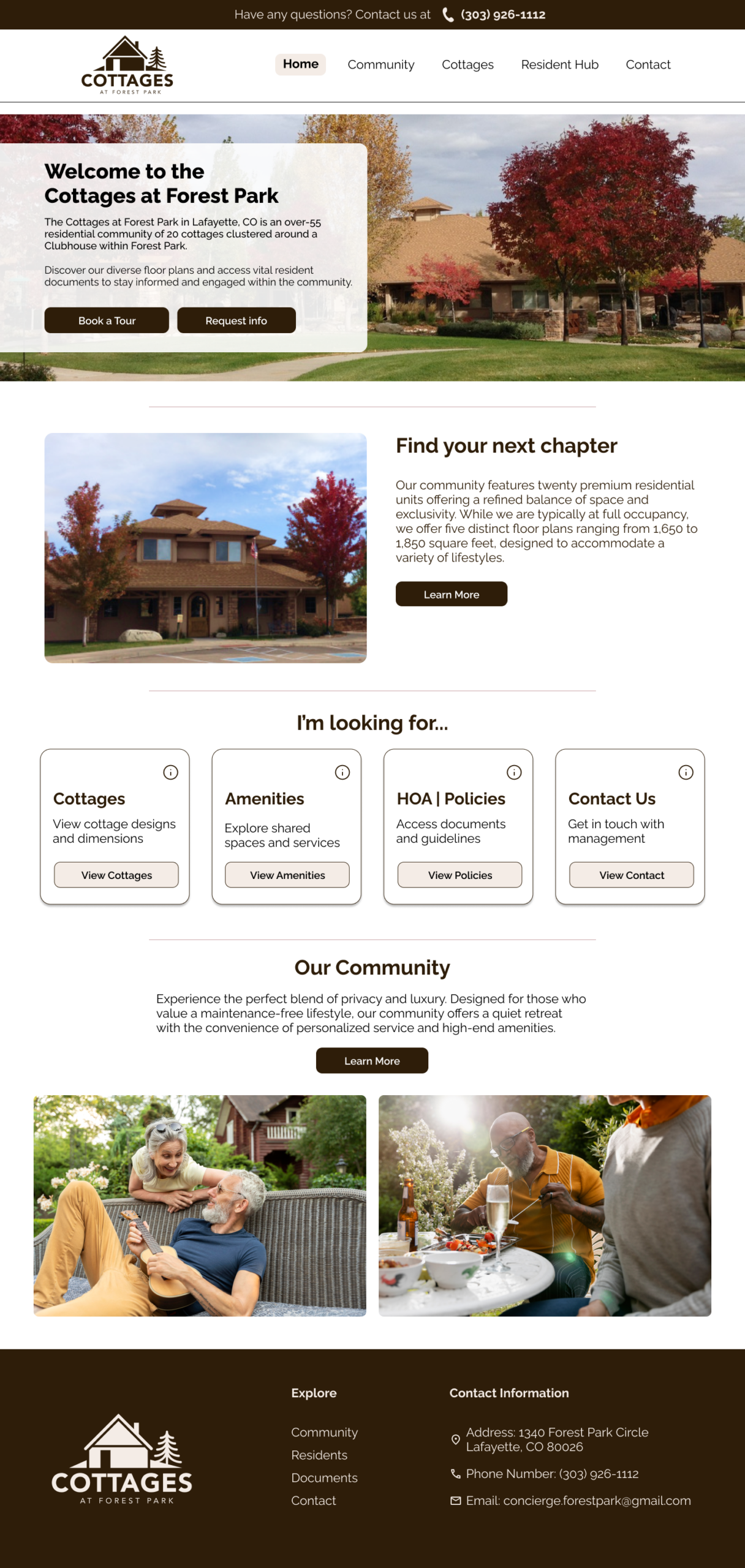
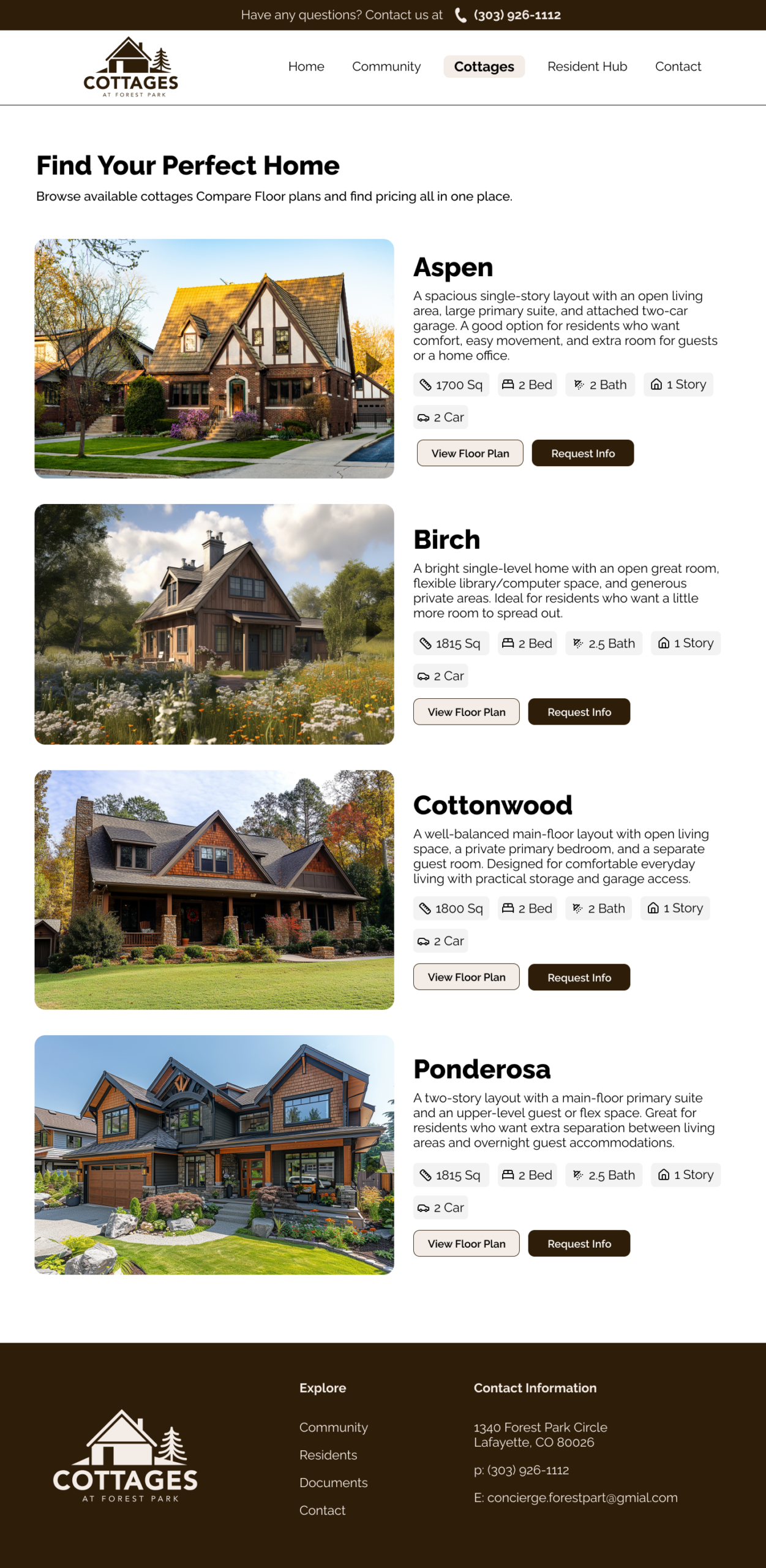
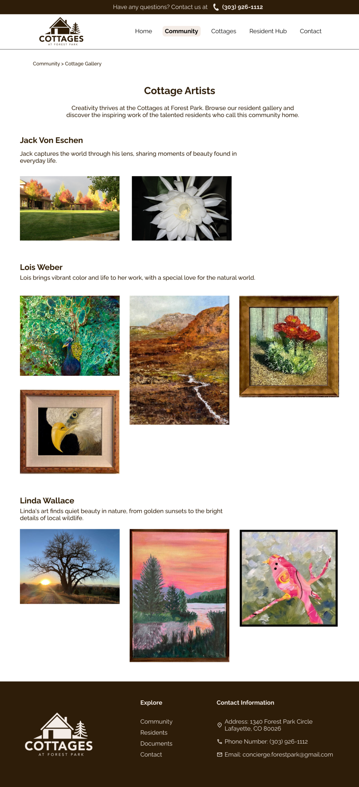
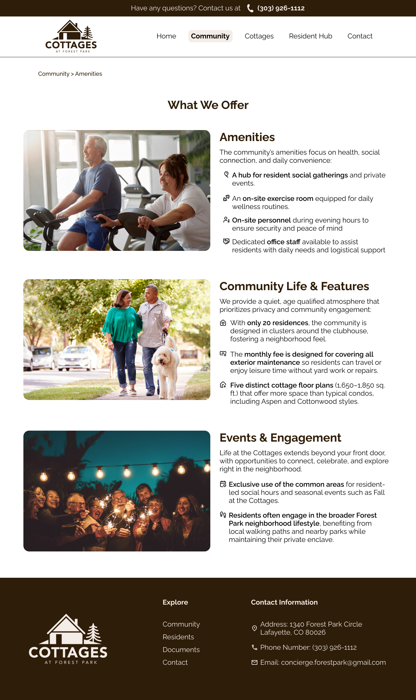
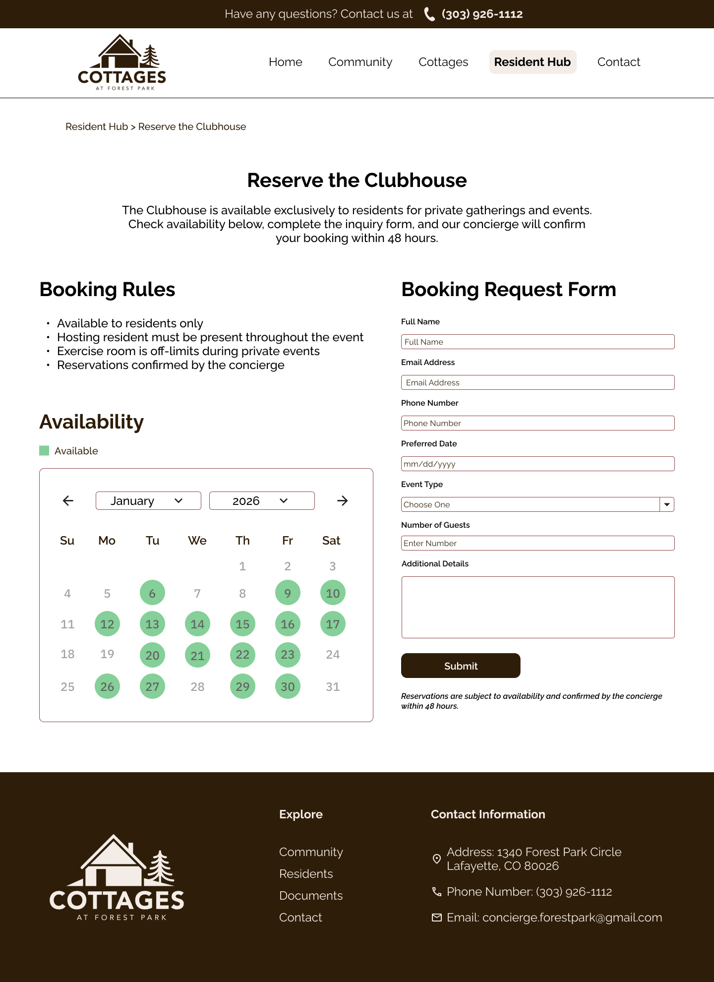
The homepage was updated to better explain the community, improve visual hierarchy, and give users clearer paths to important sections. A homes listing page brings multiple housing options together in one place, making it easier to compare home names, floor plans, pricing, and details. An individual home detail page lets users view pricing, amenities, floor plans, images, and next steps all in one place.
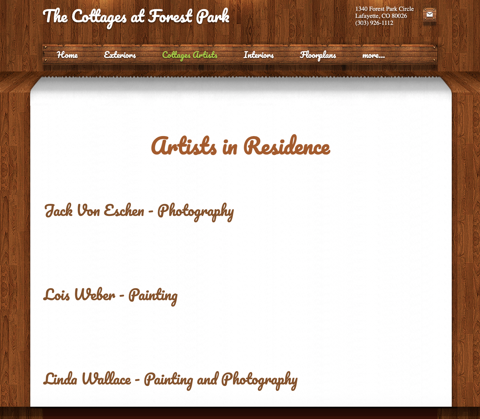
Old Design
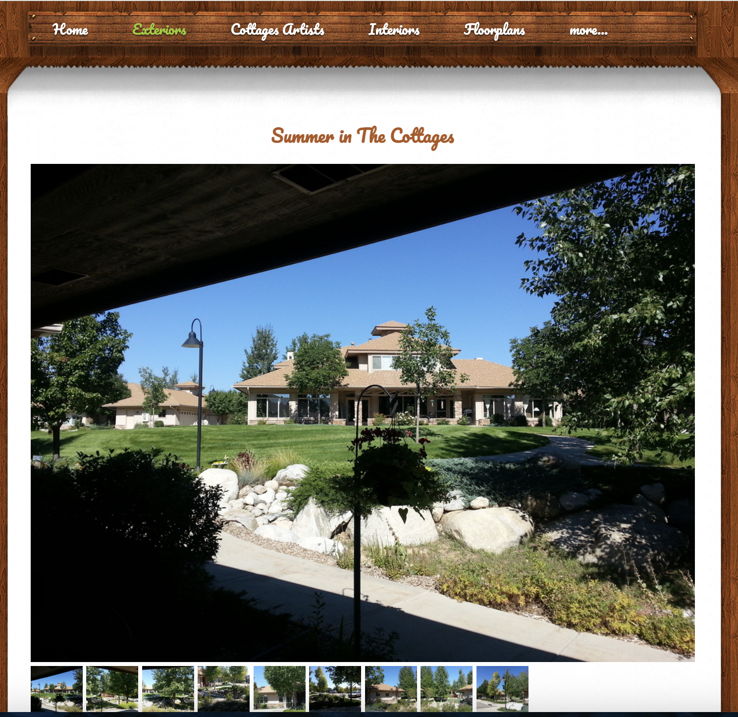
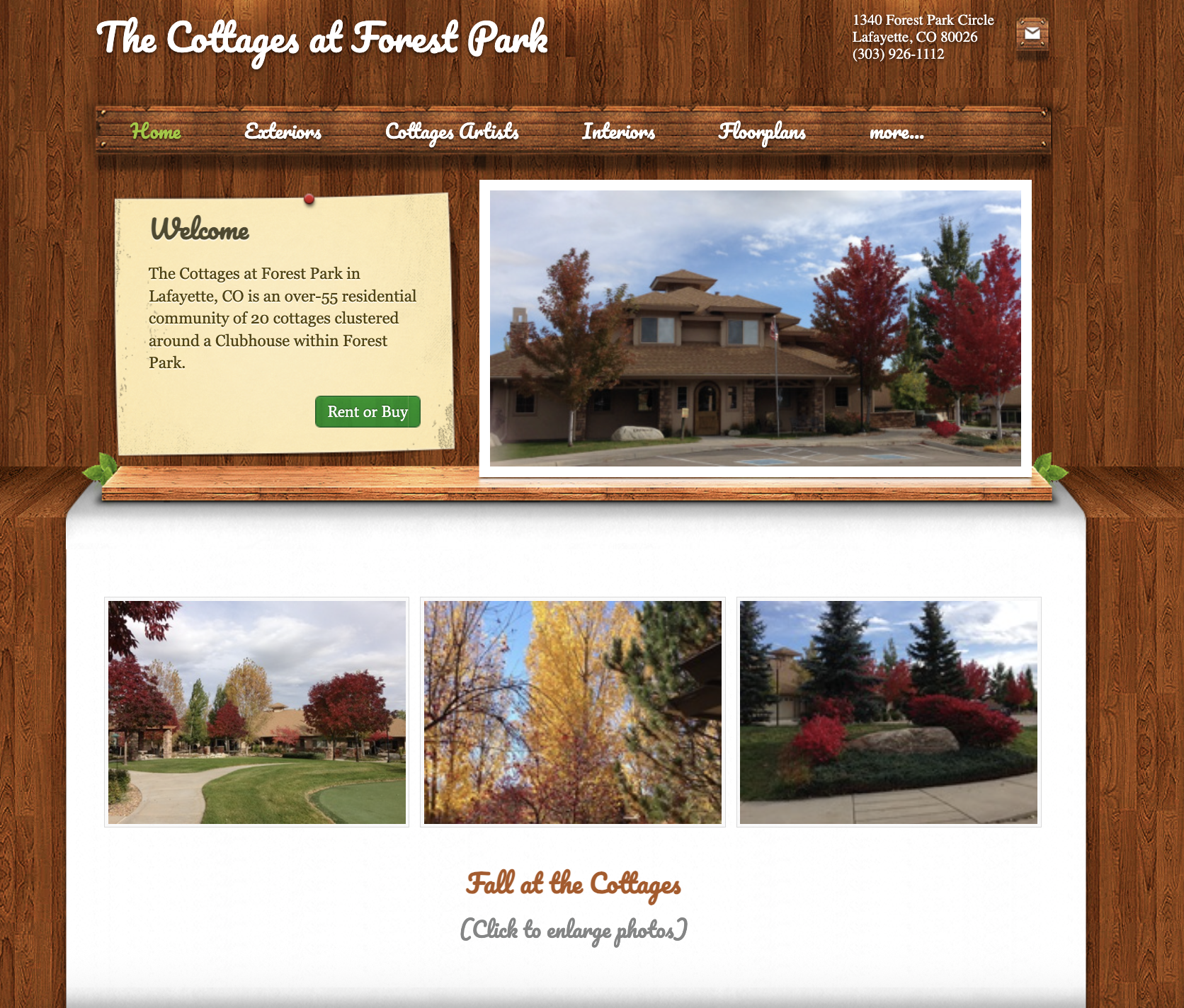
The original Cottages at Forest Park website felt dated and visually inconsistent. While it contained useful information, the design did not clearly communicate the warmth, comfort, and sense of community that a 55+ residential space should convey.
The original design lacked a strong visual identity system. Typography, layout, and imagery did not always feel unified, and the overall presentation did not help guide users through important information.
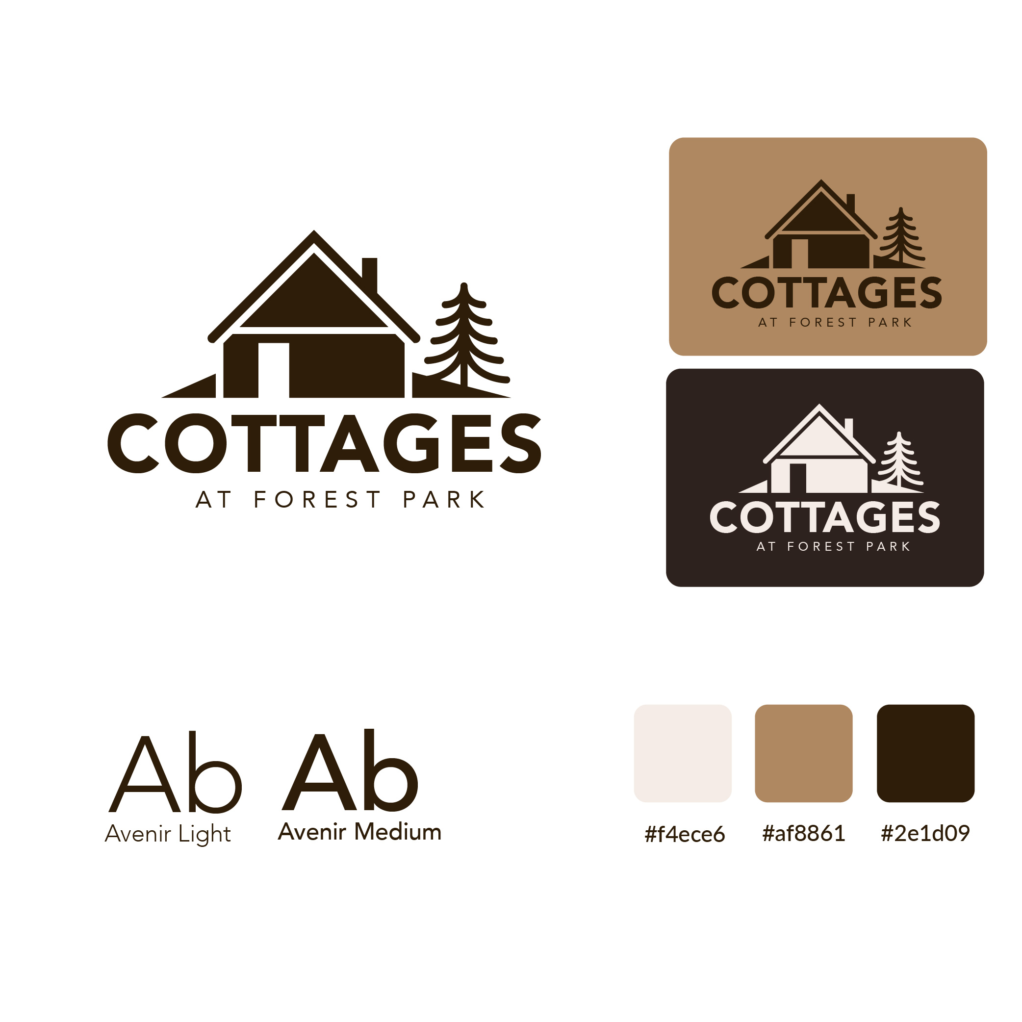
New Branding
The new branding was created to give Cottages at Forest Park a more warm, welcoming, and modern identity. The goal was to reflect the comfort of home, the quiet beauty of the community, and the sense of connection that residents are looking for. The updated logo uses a simplified cottage icon paired with a tree element to visually represent both housing and the natural setting of Forest Park.
The new visual system introduces a softer, more refined color palette built around warm neutrals and rich brown tones. I also selected Avenir Light and Avenir Medium to create a clean and readable typographic system that feels modern without being harsh. Together, the logo, colors, and typography create a more cohesive brand identity.
New Design
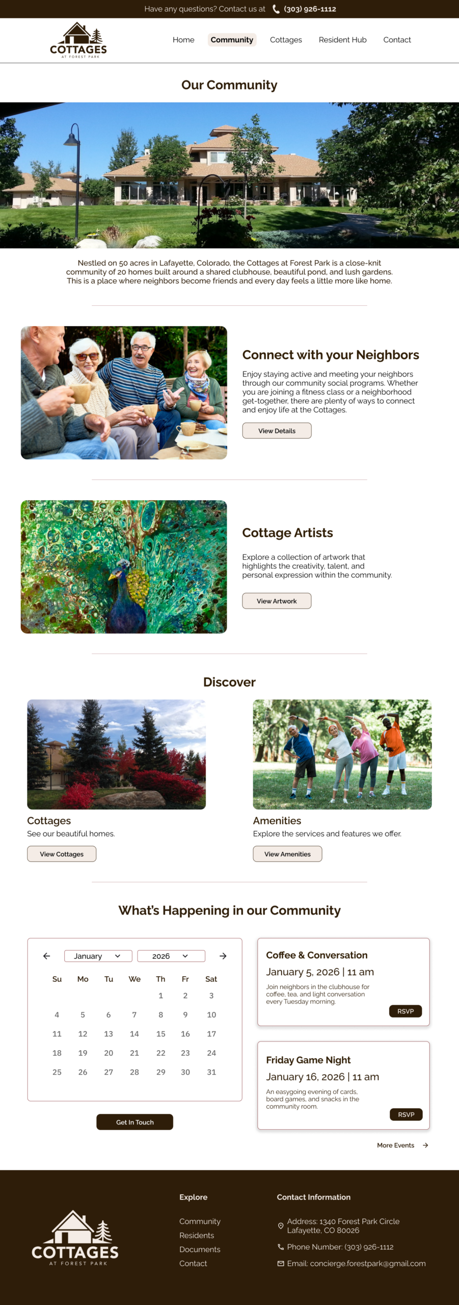
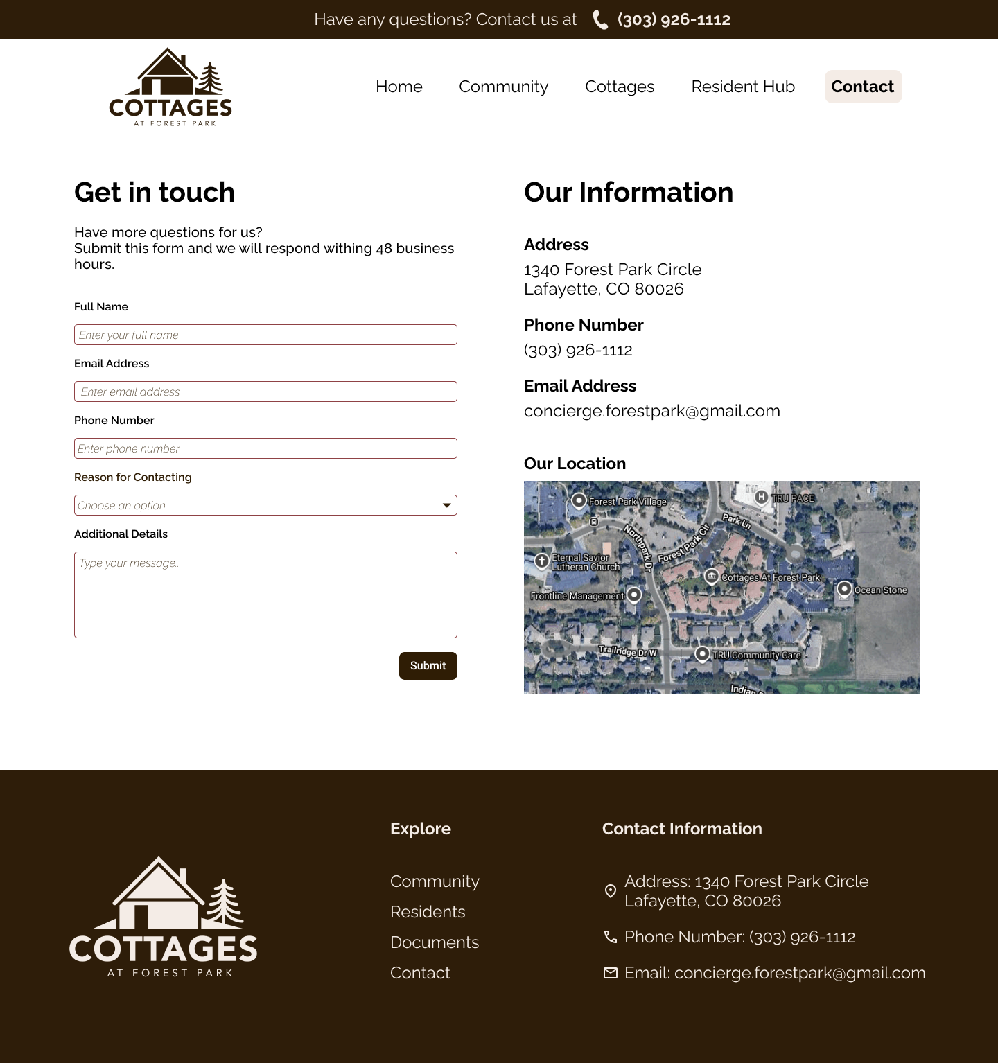
The new design reimagines the Cottages at Forest Park website as a clearer, warmer, and more accessible experience for both prospective and current residents. Guided by user research, heuristic evaluation, and usability testing, the redesign focuses on improving the homepage, community page, and contact page while also strengthening the cottages, FAQ, and artist sections.
Major Issues
Addressed
The prototype drafts focused on solving three major usability issues:
Problem: Users were often unsure what the site was for.
Solution: The homepage was redesigned with a clearer structure, stronger messaging, and clearer calls to action.
Problem: Users struggled to locate or compare homes, floor plans, and pricing.
Solution: A dedicated homes listing page and home detail page were created to bring this information together.
Problem: Users had to move between multiple pages and documents to find basic answers.
Solution: Information was reorganized into clearer page groupings with stronger labels and more direct access to important content.
Reflection
This project taught me that users do not experience a website the way designers or stakeholders assume they do. Even when information is technically present, users may still feel lost if the structure, labels, and content grouping do not match their expectations.
I also learned how important it is to listen closely during moderated testing. Many of the strongest insights came not from whether users completed a task, but from:
- where they hesitated
- what they expected to see
- what made them feel uncertain or frustrated
This project also reinforced the importance of designing for clarity, especially when the audience includes older adults or family members making high-stakes housing decisions.
If I continued this project, the next step would be to turn these drafts into a high-fidelity prototype with real content, connected flows, and more refined interaction design. I would also want to test the revised layouts with users again to validate whether the new structure improves confidence, speed, and task completion.
Overall, this project helped me practice moving from research to synthesis to design direction. It was a valuable experience in using UX methods to solve real problems with clarity, information architecture, and trust.